Updated 2021-07-01 to use Dash 1.19 and fontawesome icons
Dash Bootstrap Components has a fantastic library of plug and play components that make it easy to get started.
Plotly’s documentation is focused on making tables, charts, and graphs, but for executives I find myself relying on KPI cards like this: 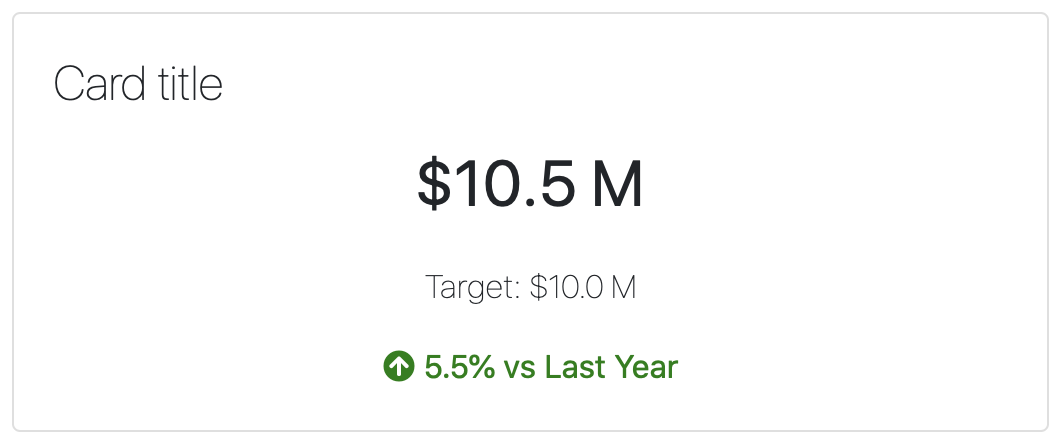
You can find better styled examples of these all over the place if you google ‘HTML/CSS dashboard examples.’
The magic of using Dash is that you can style these to your heart’s content with CSS and all of the values can be generated with Python, and the whole thing can be reproducible and components can be shared across projects. And the flexbox system is just fine rather than fiddling with positioning in PowerBI.
Here’s the sketch of the starter KPI dashboard: 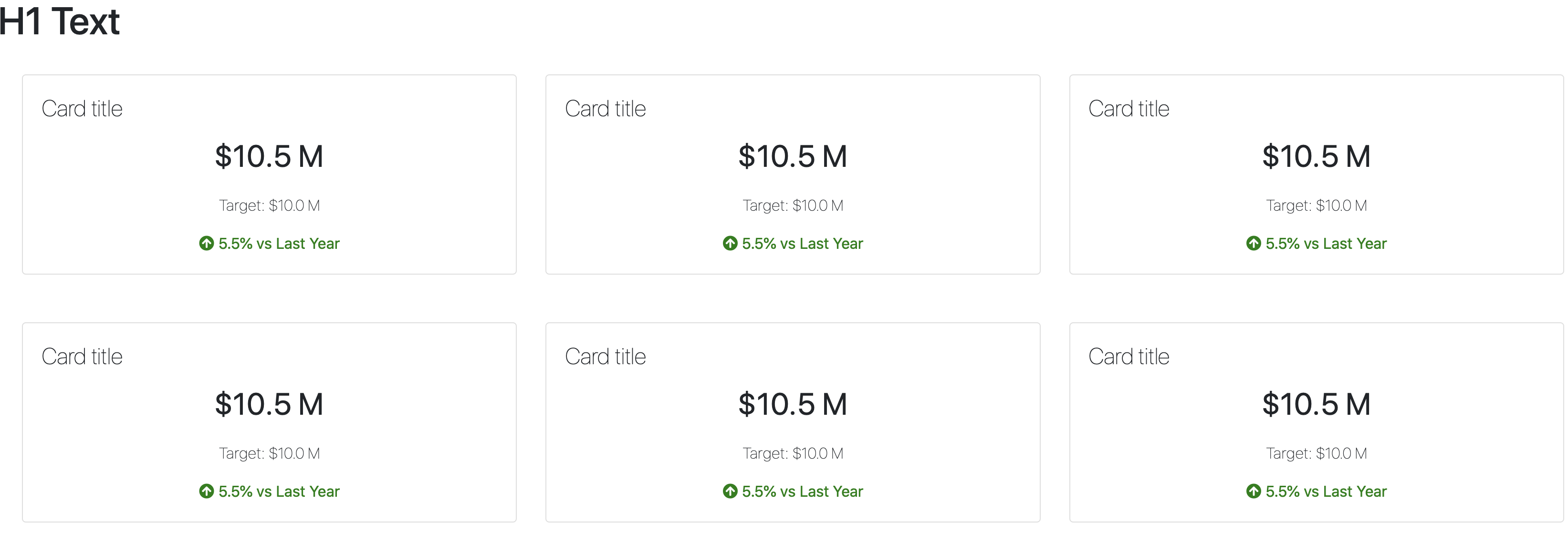
Python Code for your app.py file:
import dash  # (version 1.19.0) pip install dash

import dash_bootstrap_components as dbc
import dash_html_components as html

fontawesome_stylesheet = "https://use.fontawesome.com/releases/v5.8.1/css/all.css"

app = dash.Dash(external_stylesheets=[dbc.themes.BOOTSTRAP, fontawesome_stylesheet])

header = html.Div([
    dbc.Row(dbc.Col(html.H1("H1 Text"))),
])

card = dbc.Card([
        dbc.CardBody([
                html.H4("Card title", className="card-title"),
                html.P(
                    "$10.5 M",
                    className="card-value",
                ),
                html.P(
                    "Target: $10.0 M",
                    className="card-target",
                ),
                html.Span([
                    html.I(className="fas fa-arrow-circle-up up"),
                    html.Span(" 5.5% vs Last Year",
                    className="up")
                ])
            ])
        ])

row = html.Div([
        dbc.CardDeck([
                card,
                card,
                card,
            ]),
    ], style={'padding': '25px'}
)

app.layout = html.Div([
    header,
    row,
    row
])

if __name__ == "__main__":
    app.run_server(host="0.0.0.0", port=8080, debug=True)
The ‘up’ arrow icon is courtesy of fontawesome, which we load with the external stylesheet. Since this is all in python it’s simple to turn this into a function and create conditional (i.e. if) statements to change the icon and color scheme for your data.
Here is the basic CSS styling that goes with this:
.card {
  text-align: center;
}
.card .card-title {
  text-align: left;
  font-weight: lighter;
}

.card .card-value {
  font-size: 2rem;
}

.card .card-target {
  font-size: 1rem;
  font-weight: lighter;
}

.card .down {
  color: red;
}

.card .up {
  color: green;
}